Responsive design is no longer optional. With users browsing across foldables, desktops, wearables, and smart devices, websites must adapt seamlessly. In this article, we’ll cover the best practices for implementing responsive design in 2025, building on lessons from our guide on How Responsive Design Shapes Ecommerce in 2025.
1. Start With a Mobile First Mindset
Designing a mobile first ensures simplicity, fast load times, and scalability. By prioritizing smaller screens first, you guarantee your design works in the most constrained environment. This approach also aligns with Google’s mobile-first indexing, which determines search rankings.

2. Use Flexible Layouts, Grids, and Breakpoints
- Flexible layouts: Use fluid grids, relative units, and flexible typography so elements resize smoothly.
Example (CSS Flexbox for responsiveness):
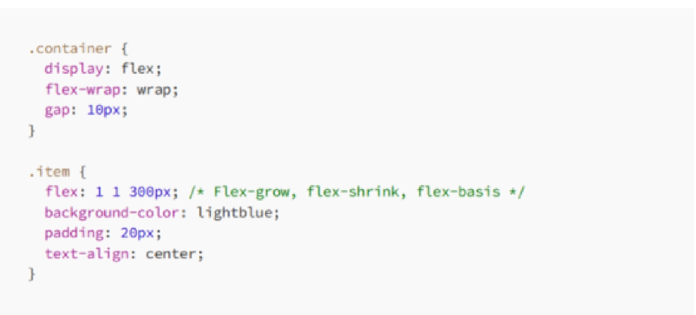
- Breakpoints: Define clear breakpoints for mobile, tablet, and desktop. In 2025, component-level container queries are increasingly used to make designs modular and adaptable.
For inspiration, check UXPin’s responsive design examples.
3. Optimize Visual Content for Speed
Responsive images, modern formats like WebP, and SVGs for icons reduce load times while keeping visuals crisp. Serving appropriately sized assets ensures high-quality visuals without sacrificing performance.
4. Embrace Progressive Enhancement
Progressive enhancement means starting with semantic HTML for core functionality, then layering in CSS and JavaScript for richer experiences. This keeps websites accessible, lightweight, and functional on any device.
5. Test Across Devices and Real Scenarios
Testing only on emulators is not enough. Use real devices whenever possible to catch layout issues and performance problems. Tools like Chrome DevTools and Lighthouse are great, but hands-on testing delivers the most accurate feedback (Medium guide).
6. Prioritize Touch Targets and Simplicity
Ensure buttons and links are large enough to tap comfortably. Aim for a minimum target size of 44 x 44 pixels with enough spacing. Simplify menus and consider progressive disclosure so only essential items show upfront. Use Chrome DevTools (Ctrl + Shift + M) to test different screen sizes, but also check on actual phones and tablets. (Mobile ecommerce best practices).
7. Design for Accessibility and Inclusivity
Responsive design should work for everyone. Offer options like dark mode, adjustable contrast, and reduced motion settings. Our article on Dark Mode UX shows how personalization improves usability.
For broader impact, embrace inclusive design, ensuring your site adapts to different abilities and contexts.
8. Focus on Performance from the Start
Performance is part of UX. Lazy load images, minimize JavaScript, and prioritize CSS. Keeping Core Web Vitals strong improves both user experience and search ranking.
9. Leverage Container Queries for Components
Container queries make components responsive based on the space they occupy, not just the viewport. This makes design systems more modular, reliable, and easier to scale across different projects.
10. Monitor, Iterate, and Improve Continuously
Responsive design is never finished. Track analytics, Core Web Vitals, and bounce rates. Regularly refine layouts, accessibility, and performance to stay competitive.
Collaborative tools also help. Teams that use platforms like Figma align designers and developers early, avoiding costly fixes later.
Future-Proofing Your Design Strategy
Implementing responsive design in 2025 is about more than fitting content to different screens. It is about building sites that are fast, inclusive, adaptable, and future proof.
For e-commerce-specific strategies, revisit our guide on How Responsive Design Shapes Ecommerce in 2025. Together, these best practices ensure your website not only looks good everywhere but also performs, converts, and builds lasting trust.