


Responsive web design (RWD) isn’t a “mobile-only” fix anymore; it’s the operating system of modern ecommerce. By using fluid grids, flexible images, and media queries, responsive design ensures websites adapt seamlessly across foldable phones, smart TVs, voice assistants, and even wearables.
In 2025, responsive design isn’t just about looking good. It’s about speed, trust, inclusivity, and conversions, the factors that make-or-break online businesses. Lets deep dive in How Responsive Design Shapes E-commerce in 2025
Why responsive design still dominates
- Universal demand: Customers now browse on everything from foldables to smart fridges. Your interface must work everywhere.
- UX & retention: Smooth, fast, user-first design keeps bounce rates low and conversions high. Applying data-driven UX design ensures sites aren’t just beautiful but optimized for performance and customer behavior.
- SEO-friendly: Google rewards mobile-first, accessible, and lightning-fast sites.
- Future-proofing: Responsive sites adapt to new screen types and interfaces without constant redesign.
Trends shaping ecommerce in 2025
1. AI-powered layouts & container queries
AI-driven designs now adapt dynamically to screen size, content, and user behavior. Container queries allow designers to control layouts at a component level, creating smoother experiences (Cisin).
2. Progressive Web Apps (PWAs)
PWAs deliver app-like speed, offline reliability, and responsive UX without the app store overhead. Alibaba, for instance, saw a 76% increase in mobile conversions after launching a PWA (Mobiloud). PWAs also tend to be more cost-effective than native apps, offering 3–8× lower development expenses (Medium).
3. Voice-optimized UI
Voice shopping continues to grow. Responsive ecommerce sites now support voice-first intent, larger tap zones, and simplified navigation for seamless hands-free shopping.
4. Dark mode & accessibility everywhere
Shoppers expect websites to respect their preferences. By 2025, responsive ecommerce adapts automatically for dark mode and screen-reader compatibility. The rise of dark mode UX shows how much users value personalized, eye-friendly interfaces.
5. Slick animations & minimalism
Subtle transitions, bold typography, and immersive visuals make browsing feel engaging while keeping performance top-notch.
6. Inclusive design & user autonomy
Accessibility isn’t optional. Today’s ecommerce sites let users customize contrast, fonts, and motion settings, empowering neurodivergent or visually impaired shoppers.
Ecommerce homepage design in 2025
First impressions matter
Clean layouts, bold product photography, and minimal distractions grab attention instantly.
Conversion-focused layouts
Sticky search bars, clear CTAs, and intuitive navigation guide shoppers to purchase faster.
Personalization & dynamic content
AI tailors banners, recommendations, and content blocks so returning users see products that truly matter to them (Shopify). Conversational AI now manages complex queries, support tickets, and workflows, delivering 24/7 service, faster resolutions, and lower costs.

AI-generated response to a customer asking if they can change their shipping address post-purchase.
Reference: https://www.shopify.com/blog/ai-trends
Speed & responsiveness
From foldables to smart TVs, ecommerce sites must load instantly. Optimized images, lightweight animations, and responsive layouts directly impact rankings.
Building trust from the start
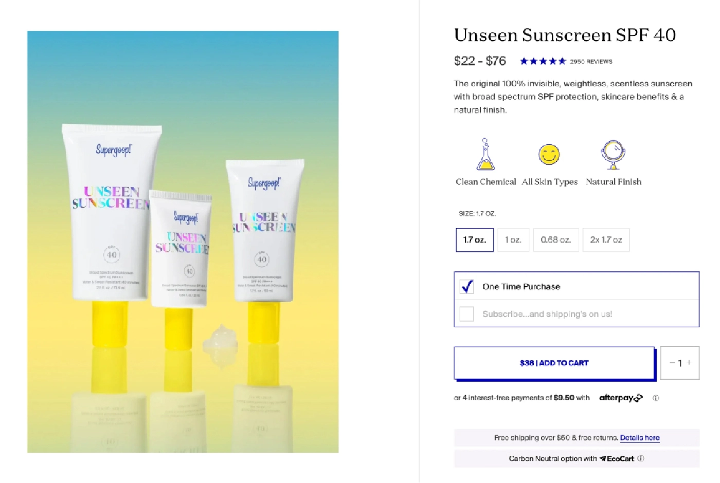
Trust signals, reviews, free shipping highlights, return policies, and security badges should appear above the fold to build confidence instantly. A clear return policy boosts sales by reducing cart abandonment and building customer trust. Shoppers feel confident knowing they can send items back easily and without fees.
Supergoop highlights this well: it offers a self-service returns portal and promotes free returns on every product page
Why this matters?
| Impact Area | Why It’s Critical in 2025 |
| Conversion rates | Responsive checkouts convert up to 35% more. |
| Customer trust | Seamless design builds credibility and loyalty. |
| SEO visibility | Google ranks mobile-first, fast, accessible sites higher. |
| Omni-device loyalty | Shoppers switch devices constantly, responsive continuity keeps them buying. |
| Inclusivity | Accessible design expands reach and boosts brand sentiment. |
Pro tips for ecommerce brands
- Design mobile-first: Scale up from small screens, not the other way around.
- Adopt PWAs: Faster, offline-ready, app-like ecommerce experiences.
- Leverage AI & container queries: Build layouts that adapt intelligently.
- Prioritise accessibility: Include dark mode, flexible contrast, and customizable fonts.
- Test everywhere: Use emulators, real devices, and feedback loops to catch issues.
- Measure relentlessly: Core Web Vitals, GA, and Lighthouse keep performance sharp.
- Collaborate early: Modern teams rely on collaborative design with Figma to align designers and developers seamlessly.
Responsive design isn’t a trend; it’s the foundation
In 2025, responsive design is the baseline for ecommerce success. It isn’t about “looking nice.” It’s about building flexible, inclusive, profitable, and future-ready experiences that work for everyone, on every device.
If your site breaks on foldables or smart TVs? That’s your competitor’s chance to steal from your customer.







One Response
Nice