
Dark mode UX isn’t just a design trend anymore. It’s the default setting for millions of people.
Apps, websites, and operating systems have all added dark mode because users actually prefer it, especially now that screen time is at an all-time high.
The reason?
Bright white screens get exhausted fast.
Dark mode cuts the glare, reduces strain, and lets you focus on what’s on the screen without burning your eyes. Learn more about Dark Mode UX: Why Users Are Choosing Darker Interfaces
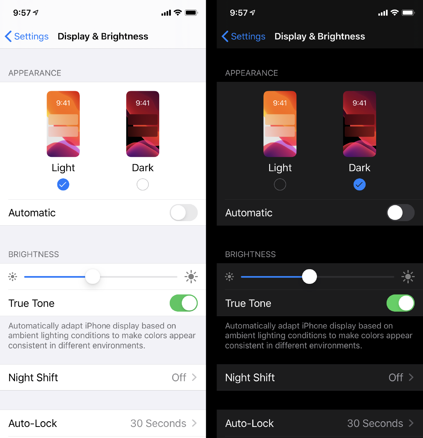
Why Users Are Obsessed with Dark Mode
1. It’s Way More Comfortable
If you’ve ever opened a bright app in a dark room, you already know the pain.
Dark mode is just easier on your eyes, especially at night or in low-light settings. It minimizes blue light and reduces screen fatigue.
Studies show dark interfaces can lower eye strain for heavy device users. No wonder developers and designers love it so much.
2. It Saves Your Battery
This isn’t just about the vibes. It’s about power, too.
On OLED screens, dark mode turns off unused pixels. That means longer battery life and less energy drain.
Some reports suggest dark UIs can use up to 6x less power than bright ones. For users, that’s a huge win.
3. It Looks Cooler (Let’s Be Real)
Dark mode just feels more premium. It looks sleek, modern, and minimal.
That’s part of the reason it’s become a go-to aesthetic for apps targeting creative professionals, gamers, and tech-savvy users.
4. It Puts Content Front and Center
Dark mode naturally makes text, visuals, and CTAs stand out.
There’s less visual noise, so important stuff pops up. It’s a built-in way to focus the user’s attention.
How the UX World Flipped to Dark
Dark mode started as a niche feature. Now it’s everywhere.
- X (formerly Twitter) led the way in 2016.
- Adobe, Spotify, Microsoft Word, and Facebook quickly followed.
- Gaming apps love dark UIs for immersive visuals.
- Stack Overflow launched dark mode after user demand went through the roof.
- Even the White House website added dark mode for accessibility.
By 2025, it’s not just about offering dark mode, it’s about designing with it in mind from day one.
Why UX Teams Are Prioritizing Dark Mode Now
In 2025, dark mode isn’t a bonus feature. It’s part of a good product design.
Brands are building adaptive interfaces that switch between light and dark based on user preference, time of day, or even location.
This makes apps and websites feel more personal, flexible, and user centric.
The Flip Side (Things to Watch Out For)
Dark mode isn’t perfect for everyone.
- People with astigmatism sometimes find white text on dark backgrounds harder to read.
- Not all logos and brand colors work in dark UIs. You’ll need alternate versions of icons, images, and assets.
- Dark mode needs careful testing. What looks good at night might not work in bright sunlight.
That’s why smart UX teams are building both light and dark modes into their products. Users choose what works for them. The Impact of Data-Driven UX Design on Website Success
Bottom Line
People want interfaces that match real life.
They want comfort, focus, longer battery life, and a design that doesn’t feel outdated.
Dark mode delivers all of that. That’s why it’s here to stay.
If you’re building a website, app, or SaaS product in 2025, dark mode isn’t optional anymore. It’s part of the core experience. Design it from the start.